Warm Colors, Cold Climes
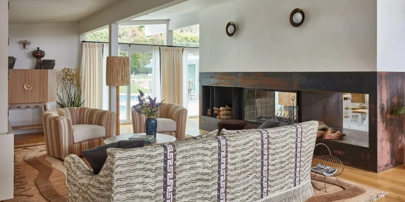
Homes & Gardens (Image credit: Michael Clifford. Design: Ward + Gray)
For those of you who haven’t been very observant, the United States has had a super cold and snowy winter so far. Winter storms have impacted millions of Americans, and the falling mercury has inspired us to write about how to decorate to add warmth to your home, particularly if you live where winter packs a punch.
Here’s a good starting point: warm colors transform homes by counteracting limited sunlight and cooler outdoor palettes. They create inviting, cozy interiors that feel both comfortable and sophisticated.
Why warm colors work in northern homes and colder climes.
Enhance perceived light: Soft warm tones reflect available light, making rooms feel brighter without harsh glare.
Balance cool natural light: Northern exposure often brings bluish, indirect light; warmth in paint and textiles restores visual equilibrium.
Increase comfort: Warm hues produce a sense of intimacy and welcome—especially important in living rooms, dining areas, and bedrooms where people gather and relax.
Add depth and character: Layered warm shades—from muted terracotta to rich amber—introduce visual richness without relying on heavy pattern or clutter.
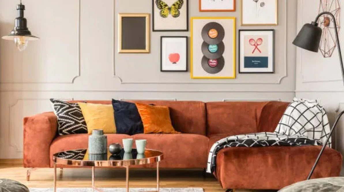
Forbes (Image Credit: Getty Images)
Here are some practical approaches you can take (one or more) to warm your interiors.
Start with walls: Choose a neutral warm base—beige with a golden undertone, a light taupe, or a creamy greige. These reflect light while preventing rooms from feeling washed out.
Accent strategically: Use deeper warm accents (rust, burnt orange, ochre) on an accent wall, in alcoves, or around fireplaces to anchor spaces and create focal points.
Layer textiles: Introduce warmth through area rugs, throws, cushions, and curtains in warm tones and textures (wool, boucle, velvet). These are easy to change seasonally.
Combine with natural materials: Wood finishes, leather, and warm metals (brass, aged bronze) amplify color warmth and add tactile richness.
Balance with cool elements: Keep a restrained cool counterpoint—stone, glass, or charcoal—to prevent spaces from feeling overly saturated and to complement northern light.
Use reflectivity wisely: Satin or eggshell finishes bounce light softly; metallic accents add subtle glow without glare.
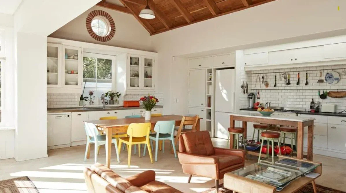
Forbes (Image Credit: Getty Images)
Try these room-by-room recommendations.
Living room: Paint main walls in a warm neutral, add a deeper warm tone on a fireplace wall, and layer textiles in golden and terracotta shades.
Kitchen: Warm off-whites or cream cabinets with a wood island and brass hardware create a welcoming hub. Consider a warm-toned tile backsplash for personality.
Bedroom: Opt for a tranquil warm greige or soft blush as the dominant color, with richer tones in bedding and an upholstered headboard for snugness.
Bathroom: Warm stone or beige tiles and warm-metal fixtures make a small northern bathroom feel spa-like and sunlit.
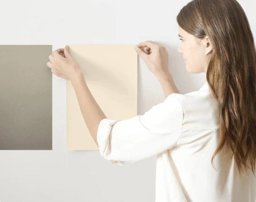
Samplize
Follow these design tips for extra confidence!
Test colors in multiple light conditions—daylight and evening—before committing.
Use paint samples large enough to judge undertones against your furniture and flooring.
Start with small changes (textiles, lampshades) if you prefer a gradual shift toward warmer tones.
Warm colors are an effective, adaptable strategy to counterbalance the coolness of northern light. Thoughtfully applied, they make spaces feel brighter, cozier, and more inviting—without sacrificing modern restraint or sophistication.
For more information on color recommendations and where you live: Homes & Gardens “Designers on How Color Trends Differ Across U.S. Regions.” Benjamin Moore “Best Paint Colors for North-Facing Rooms.” Sherwin-Williams “How Geography Affects Color Preference.” Elle Decor “Think You Know Warm vs. Cool Colors? Think Again.”