Adding Color to Your Walls

Irwin Weiner ASID -- Color is very visceral. It's very emotive for people. Picture a white room or a black room -- people feel very different in different colored spaces.
One way to choose color for a room in your home is to follow the advice of master interior designer Samuel Botero. I was told by a friend that he led one of his clients to the refrigerator and said, "Alright, here are the vegetables. Pick your colors." And food in the fridge made up the colors his client chose: hot peppers, green peppers, butternut squash, etc.
Different spaces call for different colors, and even different countries and the quality of the natural light in different parts of the world often determines appropriate color palettes. England is often dark, gloomy, and gray, and the Victorians went with very bright colors for porcelain, paint, and accessories.
Scandinavia, with its relatively weak sunlight, inspired pale grays and whites in home colors (see photo below). By contrast, Country French has its palette inspiration from hot and sunny hues. Mixing up colors and appropriate connotations can be sometimes jarring, like having hot colors in Scandinavian interiors. (Although rules should always be broken!)

In times before the 20th Century, color pigments were very expensive. Cobalt blue was made from lapus lazuli. Turquoise came from turquoise gemstones. Red was a bit more common, coming from beets and other plant materials. Color had a value once upon a time; if you had purple fabric in your house, you were wealthy. Purple was once made from rare snail shells -- and you needed a lot of shells to make pigment -- and it was used for the senators' robes in Rome.
How fortunate we are today to be able to choose from so many wonderful color sources for our homes, without having to worry about such historical connotations, e.g. purple only for the rich and famous!
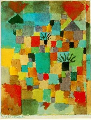
According to lore, Paul Klee, one of our most famous abstract painters, woke up one day shortly before he died and said, "I finally understand color." In other words, even experts don't always understand the full complexities of color. So don't feel bad or intimidated by it. Color can be very complex for many interior designers. Not all of them "get the color thing," but everyone should try their best to use color to maximum effect in any room.
So how should one apply paint to add color to a room?
- Traditionally, English homes had moldings painted in colors that contrasted with the wall color, e.g. white trim with red walls.
- In France, it was often the same color or a tonal difference between the molding/trim color and the wall color -- no strong contrasts.
Both decorating traditions have a different point of view and effect. We're accustomed to seeing English style coloring in many of our North American rooms, usually with white trims and moldings and colorful walls. But ideally, this English contrasting color treatment is most successful in rooms with high ceilings. That's because you run into problems emphasizing doors, let's say painted all white. If you have five doors in a room or doors placed haphazardly around a room, you might not want to emphasize all the doors so strongly by having them pop our starkly against the wall color (and again, this type of English style painting is more successful when the ceilings are higher).

English style: contrasting wall and trim colors

French style: wall and trim colors differ by tone
Here are two suggestions.
- Paint your doors white or whatever trim color you want to use, but paint the trim in the room the same color as the walls. That makes the ceilings appear taller.
- Or paint your doors a slight tonal difference from the walls (French style), either lighter or darker. This avoids making the doors stand out so strongly from the walls.
The point here is that you can use color to change the proportions of your room. If the walls are short, paint the crown molding and the baseboards the color of the walls and that will make the ceiling look further away from the floor.
One final observation. Color can be brought to your walls through many different paint and wallcovering techniques. An English approach of having red walls and white trim could have a zillion applications.
- The white could be a very creamy white or a white that has some red values brought into it.
- The red paint could be a glaze or a textured paint.
- The red could be a luxurious fabric or some type of red wallcovering.
Texture is so important, and the example I often use is asking my clients to contrast black plastic and black fur -- they're both black, but the connotation and feel of the two is quite different. So be aware of the color and the textures you bring into your room's color scheme and how they're applied, which could bring much richness and depth into your space. Flat black paint does not bring the richness of luxe black fabric walls, yet they're both black.
Photo and art credits: Centsational Girl, Kathryn Darrow, The Cottage Larder